A LOGO IS A ROCK – ANALOGY TIME
Ask any graphic designer how many times they get the question, “How much do you charge for a logo?” and I bet their answer is in the hundreds. When I get this question, I’m always hesitant to answer because hidden within that query is a misconception that is all too prevalent in small business culture.
HERE IT IS:
“ALL I NEED RIGHT NOW IS A LOGO. I’LL HANDLE THE REST OF MY BRAND AS NEEDED.”
In reality, what really happens is the rest of the brand never gets developed because of two main reasons. 1) The business owner has no idea what developing a brand entails, or 2) They frankly have no time to dedicate to it. Or, let’s be real, it’s both.
Small business owners and entrepreneurs are very capable people and oftentimes wear all the hats in their business to save money. I mean, for crying out loud, there’s an app called 17 Hats that helps to manage things for small business owners!
I COMPLETELY GET IT. BUSINESS OWNERSHIP IS HARD AND POTENTIALLY EXPENSIVE.
Lest you forget, I myself am a business owner. A solopreneur, if you will. Since heading out on my own, I’ve had to learn A BOAT LOAD of new skills for my business because it just ain’t in the budget to hire a pro yet.
DIY’ing is in my blood. As long as I can remember, my Dad almost never hired anyone to fix anything, be it a car or house issue. He would figure it out on his own – EVEN BEFORE YOUTUBE EXISTED! I know. I don’t get it either. Well, to my wife’s dismay, he passed this gene on to me, albeit a little less potent in my case. (I won’t touch plumbing with 10-foot pole.)
The reason I tell you these things is to illustrate the point that I understand the desire to handle everything in your business on your own. However, the fact remains, we are fallible humans who are not good at all things.
THIS FACT GROWS PAINFULLY OBVIOUS IN THE DESIGN DEPARTMENT.
SO, BACK TO,
“I JUST NEED A LOGO.”
Here’s the analogy I like to use whenever I’m served this request.
In ancient times – and I mean like waaay back – humans would build everything out of stones. Eventually they became so adept at carving stones into certain shapes, that they were able to use nothing but friction and counter pressure to build huge structures. Walls, palaces, villages.. You name it! I mean, come on! Check out this image! Every stone fits just right.

SO, LET’S TALK ABOUT ARCHWAYS.

THE SON OF ERIK BRAND ARCHWAY ANALOGY
Ancient archways were constructed using specially shaped stones that could be stacked on one another into the shape of an arch. The “key” ingredient was, you guessed it, the keystone. This stone sits smack dab in the middle of the highest point of the arch and acts as the anchor on which all of the other stones lean.
Remove the keystone and the arch crumbles. If all you have is a keystone, well, it’s just a rock on the ground. (Hence the title of this post)
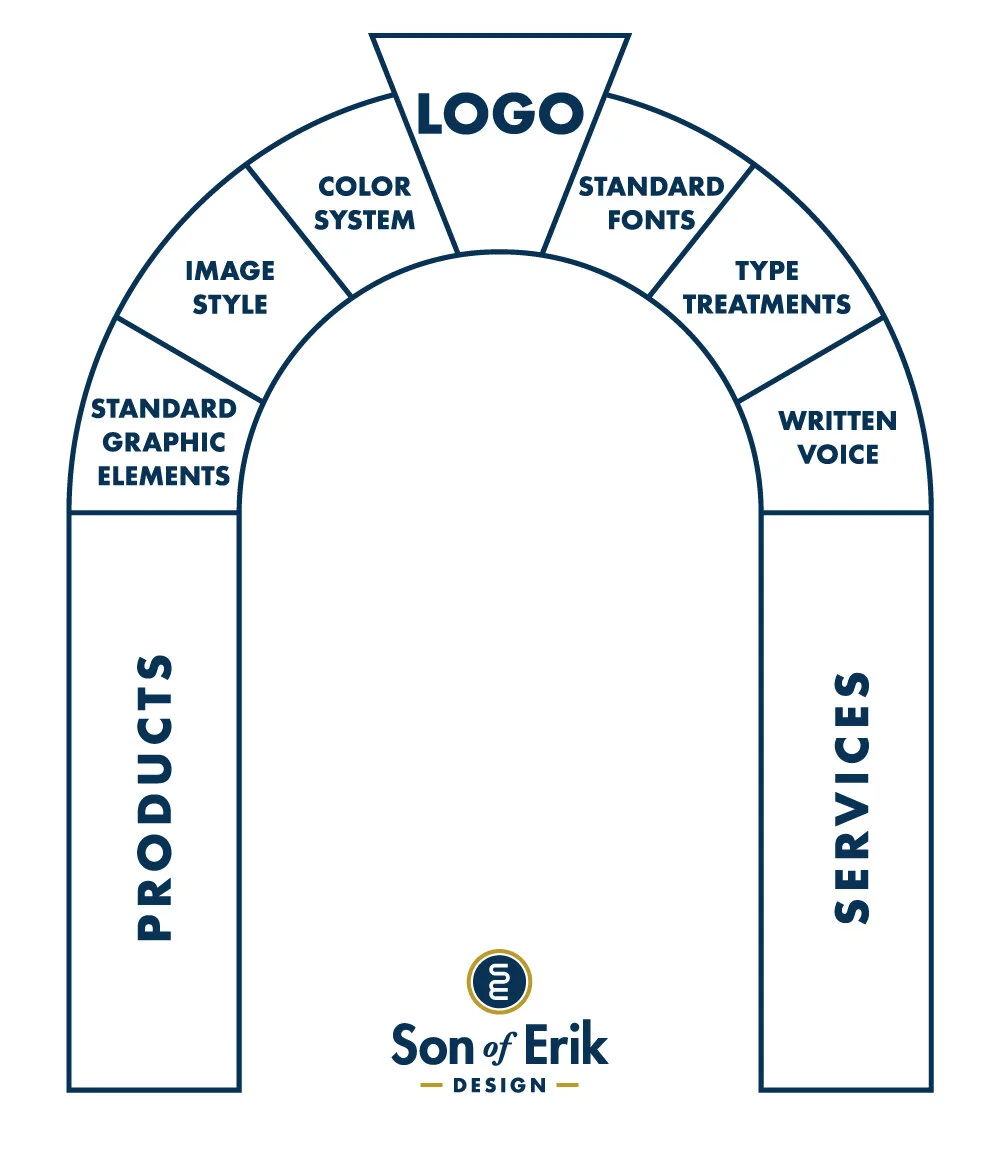
Branding Archway
Your logo is the keystone in your brand archway, and the other stones represent the other elements of your brand that are crucial to having a successful visual identity that your customers know is yours.
COLOR SYSTEM
Your colors are, in this designer’s opinion, second only to your logo. I bet you could identify a Coca-Cola truck, even if it was completely out of focus, just because of the colors. It isn’t enough to say dark blue or rose red is one of our colors. You need the color formulas for CMYK, RGB, HEX, and Pantone.
If you don’t know what those are. A designer does, and knows how to create those formulas. Ever wonder how a brand like Coke can keep that red color so consistent across all mediums of advertising? It is because they have the formulas and Pantones to make it right, every time.

STANDARD FONTS
Ugh. Fonts. That’s boring!
Buck up, partner! Your font choices carry a lot of weight in the communication department, even if you can’t see the differences from one font to another. Every font conveys a certain personality or tone that is understood subconsciously, and you need to capitalize on that.
Choose 1 or 2 font families to work with, and only a small handful of font styles within those families. (Wikipedia Sidebar) “A font family is a grouping of fonts defined by commonly shared design styles.” Think - Times New Roman Regular, Times New Roman Bold, etc.
By only working with a small number of fonts and font styles, you are much more able to keep your written text consistent across marketing mediums. Setting limits is good.
TYPOGRAPHICAL STRUCTURE (HIERARCHY)
Have you ever seen ads or marketing materials that looked like the typographical abominations in this section? I have. Many times. So, what’s the big deal about using all of those fancy fonts that your computer comes with? Or downloading every font off of Dafont.com?
The main problem is your viewer doesn’t know where to look.
There are so many things vying for attention that it just becomes a visual cacophony that is honestly difficult to look at, let alone glean information from.
Typographical hierarchy fixes this problem by setting standards for what headings, subheadings, body text, quotes, and more look like. If you have standards set in place like font size, font weight, and line spacing for different areas of your marketing, it makes things easier to navigate for your customer. People like to skim read, and breaking things up with standardized hierarchy helps them find pertinent information faster.


IMAGE STYLE
For really small businesses, this may seem like a lofty one to achieve, but it isn’t impossible to those who try.
Image style refers to the way in which a photo or image is styled by how it’s edited.
Research ads by one of your favorite companies. I’ll use Apple as a great example. I mean, you don’t become one of the world’s most valuable companies for nothing, right? Apple goes to amazing lengths to make sure all of their product photography looks like it was shot at the same time. Their photos are edited in the same way so that they become synonymous with their brand.
Instagrammers do something similar. Find a ‘Grammer who has hundreds of thousands or more followers and look at how their imagery is edited. In most cases, they use the same filters on most, if not, all of their photos. This creates a cohesive page and is visually appealing.
Lastly, and this is a hard one, stop using pixelated and blurry cell phone images to market your business. This is hard when hiring a photographer isn’t in the budget, but there are tips and tricks galore on the interwebs to help you take amazing photos with your smartphone.
STANDARD GRAPHIC ELEMENTS
Some brands like to utilize icons, shapes, lines, and other graphical elements to help communicate within their marketing. Icons are huge these days. I mean, look at your smartphone! Every app has its own icon, and likely has more icons within the app to help people navigate its contents.
It’s not enough to just throw these elements into your designs. There needs to be a system in which they are used, just like everything else I’ve talked about. We are working to create a visual language with the sole purpose of making communication easier and quicker to digest for the customer.

WRITTEN VOICE
PHEW! Last one, guys and gals.
There is a lot of reading involved for customers as they become more and more loyal to your brand, and that is why it is so paramount to develop a consistent written voice that appeals to your target audience. If the homepage of your website was written as if to middle-aged moms, but the next page written as if to teen gamers, then you have an issue.
Writing is hard and takes a lot of practice to get better at, and I have an immense amount of respect for copywriters (people who write for other businesses) and the work they do.
With Son of Erik’s written content, for example, I have done my best to cultivate a voice that is both knowledgable and approachable, and sometimes even mildly funny. (Just like me in real life!) It would be super easy for me to sound condescending or dry in my writing, but I try to make things a little more entertaining for my mom and dad, my main readers.
So, is your business authoritative, funny, sensual, conversational, dorky, punny, manly, gritty, or something else?
REMEMBER, THE MOST IMPORTANT THING IS THAT YOUR WRITTEN VOICE IS TARGETED AT YOUR BUSINESS’S AUDIENCE. FIGURE THAT OUT FIRST, THEN START WRITING.
NOW THAT YOUR BRAINS ARE FRIED…
Take a deep breath.
Believe me, I know this was a lot to take in, let alone apply to your business and brand. However, I know how important these things are to building up a successful, growing brand.
Now, if it sounds like a lot to do, and you are overwhelmed with the number of things up there, I’m here for you. Lay your branding woes on my bony designer shoulders, and I’ll wipe away your typographical tears, and… Well, you get the idea. Basically, graphic designers exist to handle these things for you. Not everyone is good at branding, and that is ok. Click the link below to fill out my form for a free consultation! And let’s start building your archway today.