New Brand in New York - a concrete raising & repair company.
A good idea that needed a lot of refinement.
Good idea.
Bad execution.
Sometimes a logo just needs some TLC.
The Concrete Team has been around under various names for over 15 years. However, with the business growing, it was time to build a brand that could house all of their services comfortably.
Old Logo
Not a bad start, but the illustrations were where this logo really started to fall apart. We decided to drop the superhero-esque muscles in favor of a more friendly and relatable set of men, while making them more anatomically sound, too.
Our critique:
The colors are way to saturated. They’re almost neon.
The characters anatomy is all wrong and not very professional in the way it represents the quality of work that the company does
The letters are too close together which makes it difficult to read at a glance
Shadows on the “The” are distracting
Eyes of the characters look like they are closed and facing away from the viewer which makes it less personal
New Logo
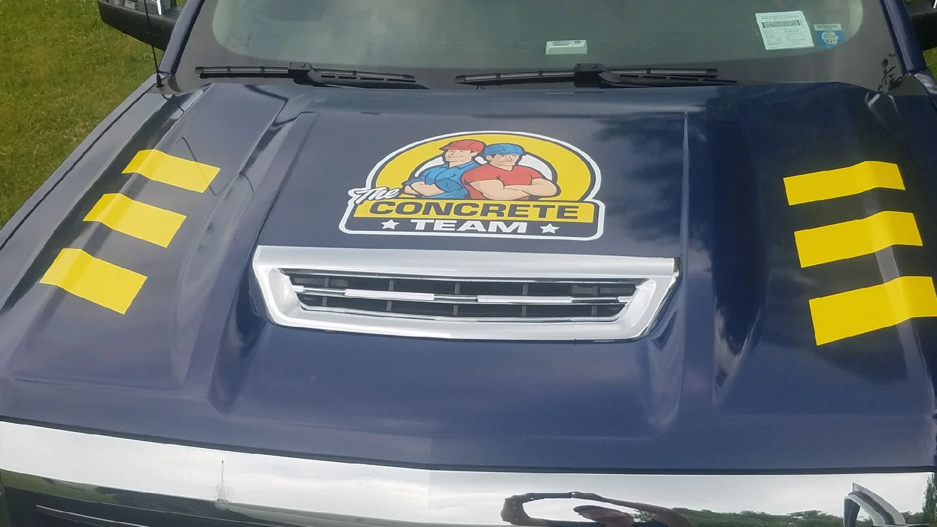
Here you’ll notice the stark contrast of the new characters to the old. You’ll also see a toned down color palette, and fonts that are not stretched or too close together for comfort.
What we did:
Redrew the characters from scratch
Toned down all of the colors so they didn’t feel so abrasive to the eyes
Changed the fonts to ones that were more easily legible
Removed unnecessary highlights and shadows that were distractions
Let’s flesh out The Concrete Team’s branding, shall we?
After the logo was complete, it was time to start really diving into the overall look, feel, and function of the brand. We developed a color hierarchy as well as a typographic hierarchy so that we could keep the look and feel consistent.


